Tutoring Review Section
Well, we’re back, and this time I wanted to make some major improvements to the website. The finished state was great, however, if I was going to use this for my actual tutoring business, I needed some customer reviews on the website. This was a part of web development that I had been intimated by beforehand; using a cloud based database and connecting this up to my website so that people can add and remove data from my website, without actually accessing the database. Since this was my first rodeo, I opted for the most simplistic solution. See the final version here.
To achieve this, I knew I needed an Object Relational Mapping (ORM) tool that allows my Next JS application to communicate with my cloud database. This pretty much means (or at least my understanding of it) I can use my ORM to go and fetch the data for me, without me having to stress too much about the code nuances. I chose the Prisma ORM since I was familar with it from previous projects. However, in those projects, I only used it with a local database stored on my machine, rather than cloud-based. This was uncharted territory. After some research, I discovered Supabase - an open source version of Firebase. I could use Supabase to create my (free!) Postgres cloud database and link it very easily to Prisma.

Now, although I had experience in SQL and SQLite, I was not completley familiar with PostgresSQL. All I knew is that they were all relational databases. This is where the beauty of Prisma comes in - I don't need to learn PostgresSQL or know the small differences between it and SQLite. Instead, I can just ask Prisma to go get the data (using the "findMany()" method), and it communicate with the Postgres database on my behalf. The ORM basically does all the heavy lifting for us when we want to create, read, update, or delete information from our database. This makes the process of using a database really intuitive which is great especially for an amateur like me. Connecting the Prisma to Supabase was also quite simple - in summary, you simply need to tell Prisma where it can contact and find the database. This is done via a URL which contains the password or key for accessing that database. As long as no one else get's their hands on that URL, the database can only be accessed by you.
So, in your Next JS application, you have a line of code that tells Prisma to find your Supabase database at said URL. That URL contains the password and location of your database, and when you publish your website, the website code pretty much exists on the internet now. If you’ve ever right-clicked on a browser and pressed ‘Inspect Element’ you may have opened up a portal that shows you all the HTML, CSS, and JavaScript that the website is defined by. So can’t someone inspect element, find the line of code that connects Prisma to Supabase, and then copy that URL for their evil plans? Thankfully, if you use environmental variables when developing your project, this will not be a problem. Environmental variables (env. variables) can be thought of as variables that we do not want to be shown on the clients side (on their browser). We want to keep these variables a secret so that when someone digs around our website code, they will not be able to find out secret information like our passcodes. I will briefly show you how they work through this example. I deployed my project using Vercel - i.e Vercel built the app using the code I wrote, and published it to the internet where anyone can access it through the correct URL (tutoring.meerenchauhan.com). When I deployed my project, I gave Vercel a list of my secret (environmental) variables and gave them each a label. Now, my Next JS code was adjusted so that in place of each of those secret variables, were the label names. Vercel then knows that when someone accesses my website, to fill in those secret lines of code, but not reveal it to the client - the client just sees the label names, but not the values! Clever stuff.

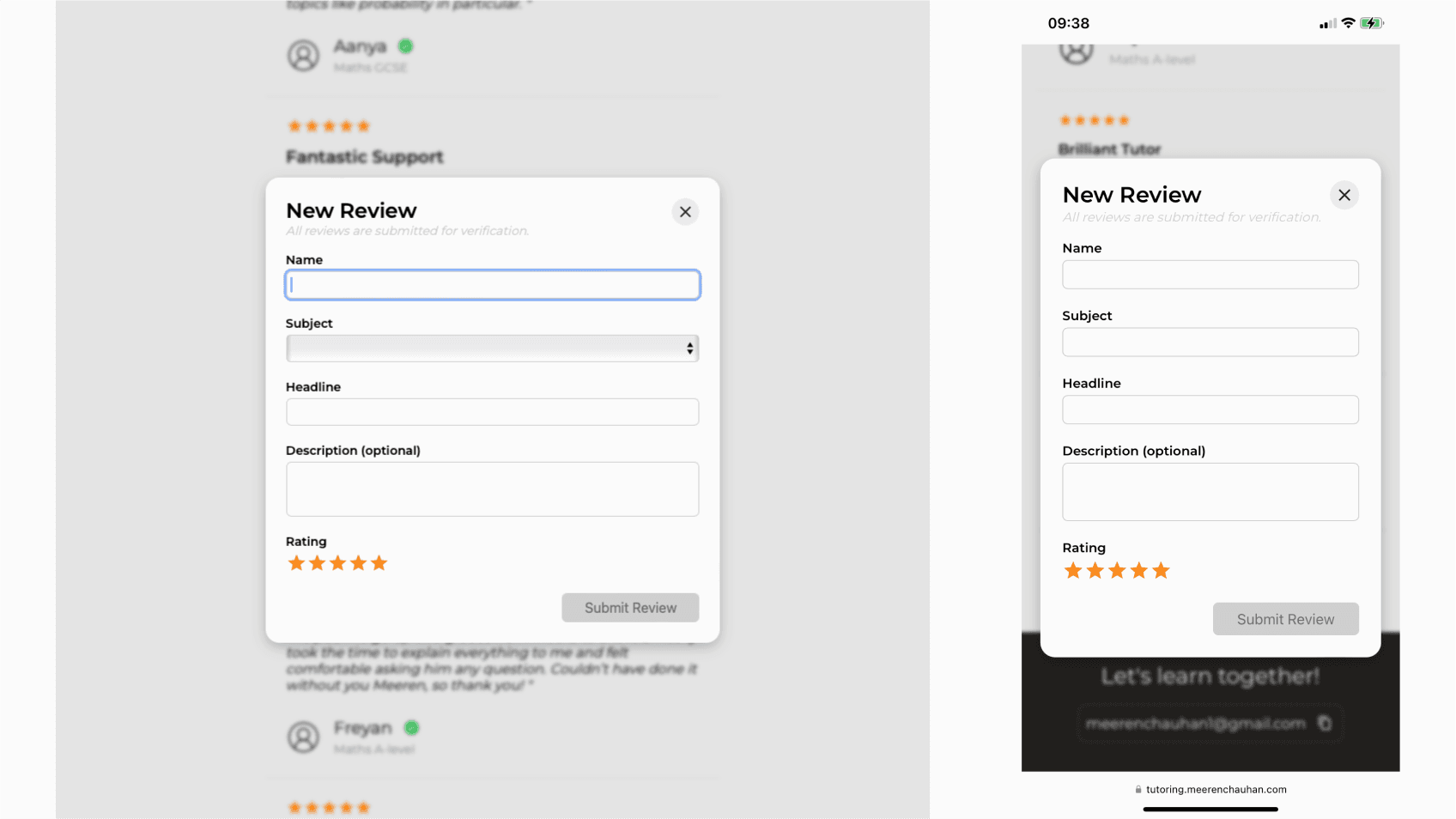
Anyway, let's get to the design now - specifically modals. A modal is a dialog popup window that is displayed on the top layer of the current screen. Now when the client gets onto the website, I wanted the form to be hidden, and pop open when a buttton ("Add Review") is clicked. There is actually a really neat way to do, and it is by using the HTML element "dialog" that comes with some nice in-built features. For example, through vanilla JavaScript, you can use the “showModal()” method on the dialog box, and it handles all the pop-up features you’d want without having to CSS it all. This includes a centrally place pop up and a greyed-out, un-clickable background! To close, simply use the “close()” method. Even better still, if you are using a form within your dialog box, you can simply add the attribute “method=dialog” in the form tag to ensure when the form button is clicked, the modal is also closed alongside submission. This was a nice neat solution to the classic form pop-up problem, so thanks to Kevin Powell for the tutorial.

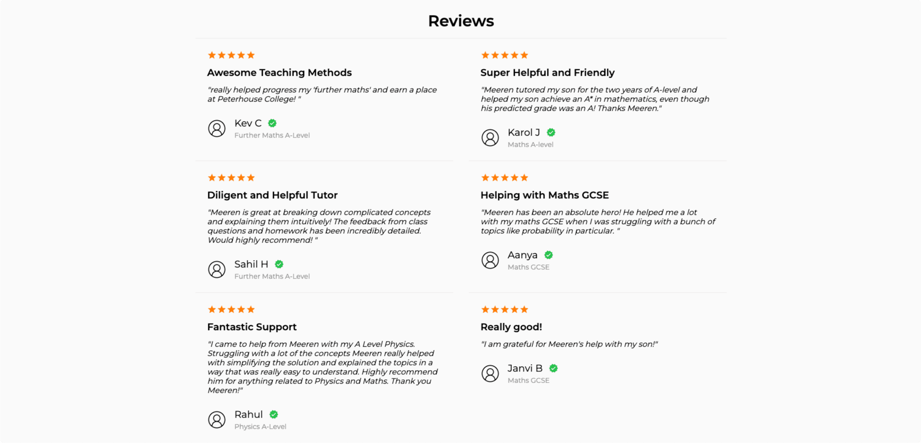
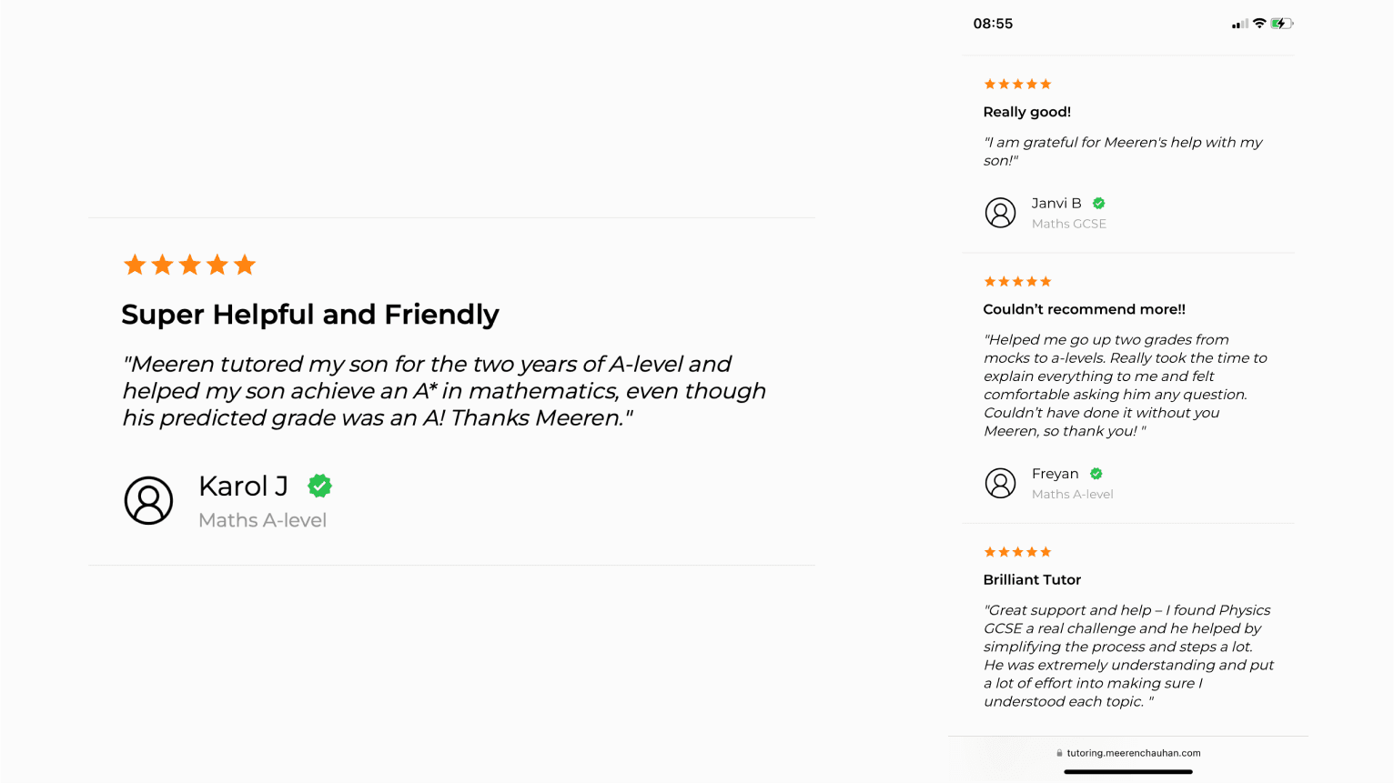
The design of the review section was important to ensure they stood out for the clients to be impressed, yet at the same time, I didn't want them being overpowering and cluttered. As I do with all design, I went surfing around and found some good examples of review sections - the most prominent being on Amazon. These guys were surely best of class, alongside Google reviews. I took inspiration from both and went for a flat, clean, and organised look - something that also fits the theme of this website. I ensured good hierarchy of components to grab the viewers attention with the bright orange stars and the bold headlines. The secondary and tertiary information cascaded to smaller and lighter coloured text to ensure the review didn't look cluttered and heavy. Light and airy was better here. I also was inspired by the Instagram blue verified tick and wanted to use that here. It was a universally recognised symbol and subconsciously portrays trust and quality - exactly what we wanted here. I actually believe that the way the review is presented has a major impact on the perceived validity of the review. That's just the way our brains work - association. To test this, I scrolled quickly across the review section. Since your brain picks up the bright 5 orange stars, the green ticks, and a few punch words like "helpful" and "friendly", the viewer is already thinking positively, without having read a single review!


